No More Google Podcasts…?
Not exactly a presentation topic, but I get so much of my presentation industry news and tech info from podcasts I feel this is a topic worthy of The Presentation Podcast. The Google podcasts app launched in 2018, and was shut down April 2, 2024. In reality, Google Podcasts are not gone, just the app. Podcasts are being integrated into YouTube Music.
![]()
If you used the Google Podcasts app, which admittedly I did not, a migration tool has been available to transfer listener podcast subscriptions to YouTube Music (the other note is the migration tool was only available for U.S. users). But now that we are in mid-April, and the reason for this blog post with my calendar reminder to investigate podcasts on YouTube Music, went off, and I have investigated. I am not seeing podcasts in YouTube Music, nor on YouTube and the Podcasts tab. There are several video podcasts, but no audio only podcasts.
The press release I found (thank you Podcast Tonight Newsletter) notes the move is part of a strategy to simplify the podcast listening experience by combining it with music streaming, creating a one-stop audio destination on YouTube Music. Google believes this change will improve podcast discovery, encourage more community interaction, and make switching between audio podcasts and video content easier – an area where Spotify is also making strides. With 23% of weekly podcast users in the U.S preferring YouTube over Google Podcasts’ meager 4%, Google sees this transition as a necessary step to cater to user needs and habits.
Note: my podcast, The Presentation Podcast, is not available on YouTube podcasts yet… adding that to my list of updates to work through!
Troy @ TLC
TPP 196
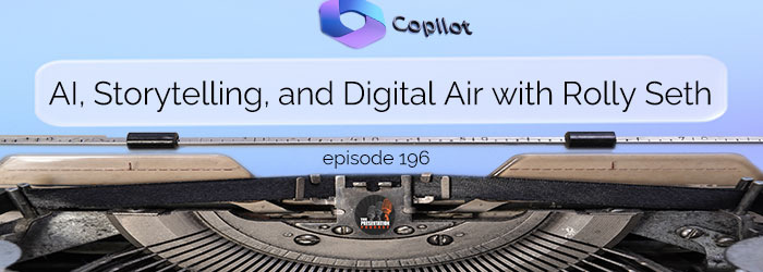
Join Troy, Nolan and Sandy for a conversation with Rolly Seth, Principle Product Manager for Microsoft Designer, about AI, copilot and storytelling. Rolly previously as on the PowerPoint team, is a thought leader and all around brilliant thinker when it comes to the intersection of technology and creativity. Click here for the conversation!
What You Do Not Know – PowerPoint Add-ins

3rd party add-ins that expand the functionality of PowerPoint are the #1 option for being a faster, better slide editor. Listen to the full conversation at The Presentation Podcast, episode 192.
What You Do Not Know – Advanced Animation with an Animation Marker!

We call this an “animation marker” and it is a fantastic hack to PowerPoint’s Advanced Animation Pane if the slide has lots of With Previous animation timings. Listen to the full conversation at The Presentation Podcast, episode 192.
PowerPoint Not Printing PDFs – Here’s Why
So this is a problem, and I am guessing I am not the only one being frustrated with their computer – PowerPoint – Outlook – print drivers.
(note: paid actor, recreating computer frustration Troy is experiencing today)
After finally getting frustrated enough to look into the problem. The problem is any PDF I attempt to print resulted in this error message.
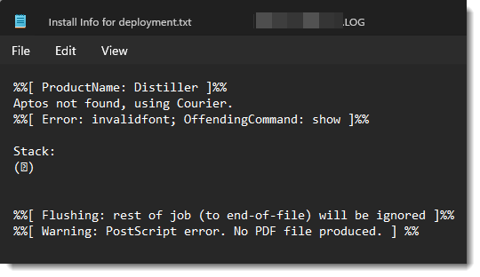
The problem is Windows, or Office. Or maybe it is an Adobe problem. But it is that Adobe is not recognizing the the new Windows default font Aptos (for more information on Aptos font, see this earlier blog post). My guess is Adobe does not recognize the font and does not know what to do with it, so it does nothing – aside from erroring out every PDF I attempt to print.
Note: I have not tested this on a Mac, but it is definitely an issue on Windows.
Here is the solution:
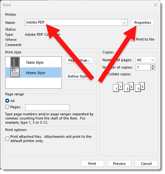
1. In the Office app (PowerPoint, Outlook, Excel, Word – they all are experiencing this issue) and file to print, go to the Print dialog and select ADOBE PDF as the printer.
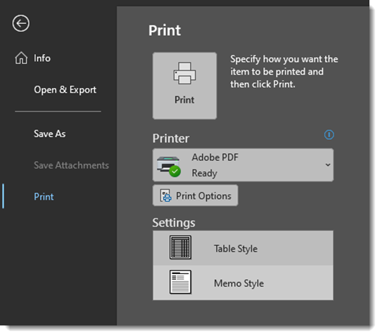
2. Click PRINT OPTIONS
3. In the Print Options dialog, ACROBAT PDF should be the preset based on selection in the print menu earlier. Click the PROPERTIES button.
4. In the Abobe PDF Document Properties dialog UNCHECK the RELY ON SYSTEM FONTS ONLY; DO NOT USE DOCUMENT FONTS option.
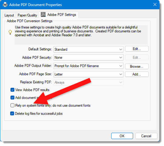
5. Click okay and the PDF should successfully print!
Note: I have not found a way to make this option unchecked by default. I also have been happy to create PDFs again and have not really dived deeper into changing the print options more permantly – mostly because I am hopeful Microsoft and Adobe will figure out this issue and fix it so this hack is not needed.
Troy @ TLC
TPP 195
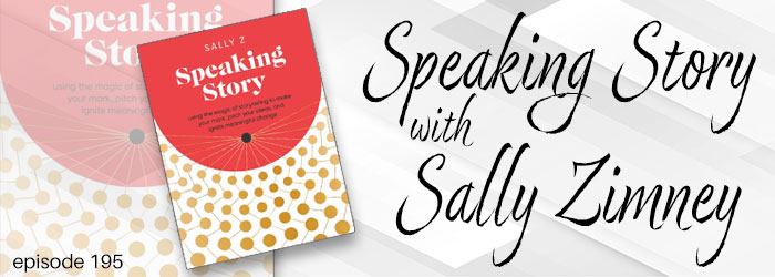
New book in the presenting space! Speaking Story by Sally Zimney is a story rich (okay, pun intended…) journey of what it means to be a speaker, how to put together your (speaker) story, and many tips & recommendations on speaking. Troy, Nolan and Sandy enjoy time talking with Sally Z on this episode of The Presentation Podcast – click here to join the conversation!
What You Do Not Know – Use a Slide Remote

Control PowerPoint with a remote, not the keyboard. Listen to the full conversation at The Presentation Podcast, episode 192.